Courtauld’s Hepworth Show Makes Color Impossible to Ignore
The Courtauld’s Hepworth in Colour reframes Barbara Hepworth by treating color as a structural force rather than a decorative afterthought
The Courtauld Is Correcting a Familiar Misreading of Barbara Hepworth
The Courtauld Gallery opens Hepworth in Colour on June 12, and the premise is sharper than it first sounds. As Artnet reported, the exhibition brings together around 20 sculptures and 30 drawings to argue that Barbara Hepworth’s use of color has been hiding in plain sight. That should not be a minor curatorial footnote. Hepworth is one of those artists whose reputation is so secure that certain habits of looking become lazy. Viewers know the pierced forms, the stringed interiors, the Cornish horizon, the wartime resilience, the sanctified position in British modernism. What they often do not register with enough force is that color in Hepworth is not cosmetic. It is structural, directional, and emotional.
The timing matters because the show arrives as museums are under growing pressure to justify why another canonical artist needs another exhibition. The answer here is unusually clear. The Courtauld is not reviving Hepworth by pretending she has been neglected. It is reopening a live interpretive problem within a body of work that has been seen too often through the filter of pure form. That is a far better institutional move than staging a generalist retrospective whose real function is reassurance. Focused shows are hardest to do well because they depend on one strong claim. This one has one.
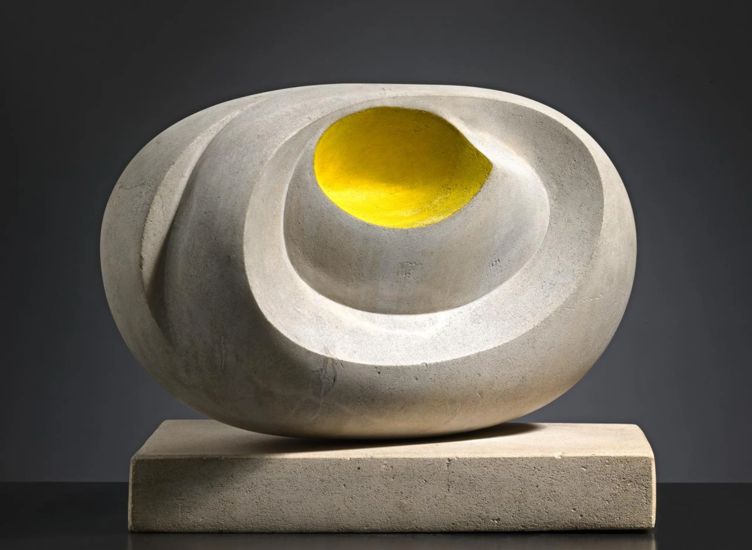
Why Color Changes the Way Hepworth’s Sculpture Reads
The official exhibition page foregrounds works such as Eidos and the group around Sculpture with Colour (Oval Form) Pale Blue and Red, and that emphasis shifts the terms of encounter. Hepworth’s sculpture has often been discussed through space, mass, carving, landscape, motherhood, modernist spirituality, and the relation between solid and void. All of that remains useful. But once color is treated as an active force, the works stop reading as austere objects lightly touched by paint. Their internal tensions become more legible. Blue can act like depth. Red can sharpen perimeter. Pale grounds can delay the point at which the eye settles. In other words, color does work.
This sounds obvious until you remember how often modernist sculpture gets narrated as if chromatic intensity were somehow secondary to sculptural truth. Hepworth’s own frustration, quoted in the Courtauld materials and repeated in press coverage, was that her use of color had been accepted without being understood. She was right to complain. Looking at the painted stringed works and the drawings gathered around them, the point is not simply that color makes the sculpture prettier or more atmospheric. It changes the relation between inside and outside. It makes openings feel less like abstract punctures and more like tuned visual thresholds. That is a formal issue, not an accessory one.
The exhibition’s concentration on the 1940s is also important. During the war years in St Ives, Hepworth’s practical conditions were constrained by childcare, shortages, and the wider brutality of the period, yet the works from these years are not reduced by limitation. They are intensified by it. The Courtauld’s related essay, 5 Things to Know About Barbara Hepworth, helps situate the artist’s material intelligence within that broader historical pressure. The palette of sea, stone, weather, and wartime compression is not anecdotal background. It is part of the visual logic of the sculpture itself.
The Show Also Benefits From a Timely Rescue Story
There is a second reason the exhibition will draw attention beyond specialist audiences. One of its anchors, Sculpture with Colour (Oval Form) Pale Blue and Red from 1943, was the subject of a high-profile effort to keep the work in the United Kingdom after it appeared at Christie’s and faced export. That acquisition campaign, led in large part by The Hepworth Wakefield with support from public funding and thousands of donors, turned the object into a story about national stewardship as well as art history. The work now enters the Courtauld not just as another exemplary Hepworth but as a piece the British museum ecosystem recently decided it needed to save.
That can produce easy sentimentality, but the best outcome is more demanding. Rescue campaigns often flatter public virtue without improving public understanding. Here there is at least the possibility of both. The saved object is being placed into an argument, not simply displayed as a trophy of successful fundraising. By assembling six variations of the same idea, along with related drawings and sculptures, the show turns acquisition politics back into looking. It asks whether a work deemed nationally significant can also alter how we read an artist’s method. That is the right question to ask after a campaign built on significance.
There is a broader institutional lesson too. Museums often claim scholarship when what they are really offering is quantity. The Courtauld has increasingly been better at the opposite strategy: smaller, sharper exhibitions that test one proposition hard. We saw that logic recently in the institution’s programming around Hepworth and Nicholson, and it keeps the gallery from treating modern British art as a matter of heritage management alone. Heritage is what happens when museums stop pressing on their own collections and stories. This show is pressing.
What the Exhibition Means for Hepworth’s Position Now
There is a local artworld angle here as well, and it is worth naming directly. The Courtauld has been building a denser Hepworth conversation across formats, not just through this exhibition but through adjacent scholarship and displays. That continuity matters because it lets viewers test one framing against another instead of treating each museum event as an isolated prestige object. Our earlier coverage of the Courtauld’s Hepworth and Nicholson studio-photographs show already suggested that the institution was interested in process, context, and visual argument rather than simple canon maintenance. Hepworth in Colour extends that strategy by narrowing the field further and asking the audience to look harder, not faster.
That is also why the show may resonate beyond Hepworth specialists. Many museum visitors know the name, recognize the silhouette of the pierced forms, and then stop there. Color gives the Courtauld a way to interrupt that automatic recognition. It turns the exhibition into a lesson about how familiarity can dull perception. If the public leaves realizing that a canonical sculptor can still be misread through decades of praise, the exhibition will have done more than improve Hepworth scholarship. It will have demonstrated why museums should keep reopening settled artists through focused problems rather than recycling omnibus retrospectives that flatter prior knowledge and ask very little of the viewer.
Hepworth’s market and museum status are already secure, so the stakes here are not about rediscovery. They are about recalibration. A color-centered reading makes Hepworth feel less like a monument to tasteful modernism and more like an artist still capable of surprise. That matters for younger audiences who may arrive with only a broad sense of her importance. If they leave understanding that color is one of the engines of her sculpture, then the exhibition will have done more than tidy up an art-historical oversight. It will have made the work newly available.
It also has implications for how British modernism gets taught and displayed. Too often the field is flattened into a sequence of national icons, each attached to one digestible strength: Moore and monumentality, Nicholson and abstraction, Hepworth and carved space. Such shorthand is useful for labels and disastrous for thought. The Courtauld’s own announcement suggests a more fluid account in which drawing, sculpture, color, and environment all feed one another. That is the account museums should be pushing if they want canonical artists to remain intellectually alive.
The show also lands in a moment when sculpture is again being discussed through material specificity after years of image saturation. Hepworth fits that turn well, but only if she is not reduced to touchable form and tasteful silhouette. Color complicates the surfaces. It stops the work from settling into the kind of mute elegance that luxury interiors love and serious exhibitions should resist. The best Hepworth has always held a tougher charge than décor can absorb.
That matters for curators beyond the Courtauld because it offers a reminder that the most productive exhibition questions are often embarrassingly simple. What have we all been seeing but not fully reading. Which element of an artist’s work has been acknowledged but conceptually underused. In Hepworth’s case, color becomes a way to reopen sculpture without pretending to overturn everything we know. More museums should be willing to work at that scale of precision. It is less grand than the blockbuster retrospective and far more likely to leave serious viewers with a usable change in perception.
What comes next is straightforward but consequential. Critics will decide whether the argument holds across the whole installation, museums will watch how focused modernist shows perform with the public, and collectors will likely read the renewed attention back into the market. But the strongest result would be simpler. If Hepworth in Colour succeeds, viewers will leave less certain that they had already seen everything there was to see in Barbara Hepworth. For an artist this canonical, that is a real achievement. It means the work has not become easier with familiarity. It means we have simply been looking at it too narrowly for too long.