How to Read the No ICE in the Cup Poster Campaign in 2026
The No ICE in the Cup campaign is more than protest branding. It is a visual strategy for immigrant safety, local organizing, and World Cup image politics.
Start by understanding that these posters are not event merch. They are organizing infrastructure
The first mistake people make with a campaign like No ICE in the Cup is to read the posters as expressive add-ons to a political argument that already exists somewhere else. That misses the point. The campaign’s own site says the World Cup should remain joyful, safe, and secure for all to enjoy and that ICE has no place near stadiums, watch parties, local businesses, or the streets where people will gather. In practical terms, that means the posters are being asked to do work. They circulate a shared demand, turn concern into public language, and make a coalition visible before the 2026 tournament’s official imagery floods every host city. As The Art Newspaper observed, the initiative is using art to kick back at the possibility of ICE presence around the tournament. A better way to say it is that the initiative is building a visual field in which resistance becomes easy to recognize.
This distinction matters because the World Cup is not just a sports event. It is a giant image system. Sponsors, municipal leaders, broadcasters, and tourism agencies all spend heavily to tell visitors what the host nation is supposed to look like. Protest that ignores that visual system usually arrives as commentary on the edge of the frame. Protest that enters the image economy directly has a chance to alter the frame itself. The No ICE in the Cup campaign understands that. Its posters are meant to travel through neighborhoods, social feeds, local actions, and downloadable toolkits long before opening day. They are a preemptive strike against political normalization. The campaign’s main page pairs that demand with references to public art, soccer matches, cultural events, and volunteer brigades, which is exactly why the work should be read as movement media rather than as a closed series of illustrations.
If you want to read the campaign well, then, begin with use rather than style. Ask where the image is supposed to appear, who can reproduce it, and what kinds of gatherings it helps convene. The campaign’s art page explicitly frames the works as free, adaptable, and available for local organizing rather than as protected objects to be admired at a distance. That is a major clue. These posters belong to the tradition of movement graphics, not the tradition of editioned art objects. Their success depends on circulation, legibility, and adoption.
Read the city-specific imagery as a map of local pressure, not just a set of clever designs
One of the strongest features of the campaign is that it does not speak in one national visual voice. The reported poster set spans host cities and gives artists room to work through local iconography, local fear, and local humor. That matters because immigration enforcement is experienced unevenly across the United States. Los Angeles, Miami, Seattle, New York, Dallas, Boston, Atlanta, Houston, Philadelphia, and Kansas City each carry different migrant histories, policing cultures, political climates, and public myths. A generic patriotic protest image would flatten those differences. No ICE in the Cup instead uses them as material.
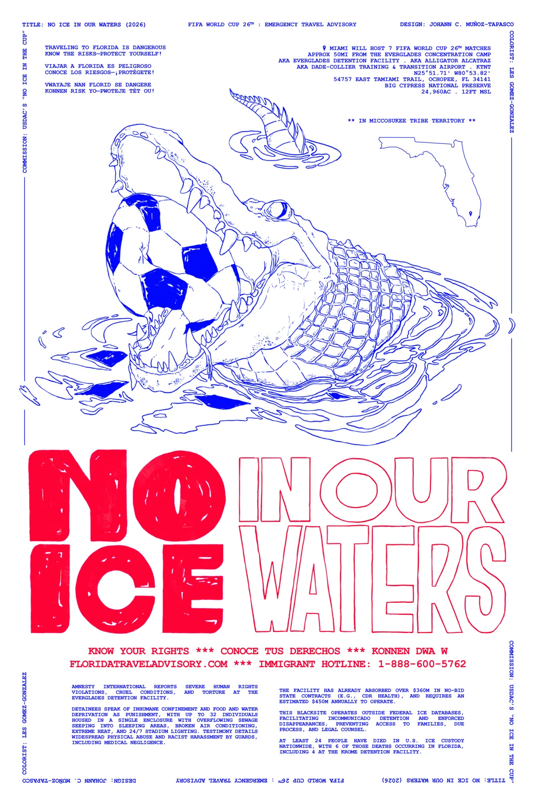
Look, for example, at the Miami poster by Johann C. Muñoz-Tapasco, which The Art Newspaper describes as text-heavy and anchored by an alligator crushing a football in its jaw. That is not random regional flavor. It turns Florida symbolism into a warning about predation, pressure, and the environment of threat surrounding the event. Cristy Road Carrera’s New York poster stages soccer players facing tactical agents, making confrontation visible rather than implied. Hana Natsuhara’s Seattle work reportedly folds the city’s coffee identity into the image, while Chris Stewart’s Los Angeles design puts a Mexico jersey under physical stress. Each poster tells you something about what kind of public injury the artist believes is imminent or already normalized in that city.
So when you encounter one of these images, do not just ask whether it is aesthetically successful. Ask what local contradiction it is trying to expose. Is it about municipal branding versus state intimidation? Is it about immigrant joy being made conditional? Is it about the gap between the global language of football and the territorial logic of enforcement? Good movement graphics are usually compact social diagnoses. They translate a broader structure into a visual scene that can be grasped quickly and remembered later.
Notice how the campaign borrows soccer’s own emotional language instead of rejecting it
A less intelligent campaign might have treated the World Cup itself as the problem, denouncing the tournament’s commercial excess or dismissing fandom as distraction. No ICE in the Cup does something more strategic. It leans into the love of the game. Lead organizer Paola Mendoza told The Art Newspaper that the campaign wanted to center both the communities harmed by enforcement and the love of soccer as the world’s sport. That is a crucial choice. It means the posters are not framed as anti-fan interruptions. They are framed as defenses of the conditions under which fandom can remain collective and joyful.
This is why so many of the images use players, jerseys, balls, match energy, and crowd emotion directly. The campaign is not trying to stand outside football culture and lecture it. It is trying to inhabit football culture before security spectacle colonizes it. That gives the work a different tone from much institutional political art. Instead of performing moral distance from popular enthusiasm, the posters argue that enthusiasm itself deserves protection. That is politically useful because it invites broader publics in. You do not have to stop loving the tournament to understand the argument. You only have to accept that love of the game should not require accepting surveillance and fear around the game.
The strategy also reveals something about contemporary protest design more broadly. Effective movement visuals rarely win by refusing pleasure altogether. They often combine warning with energy, critique with humor, or danger with a bright invitation to participate. The No ICE in the Cup campaign seems to know that people mobilize more easily around images that let them imagine a defended public life, not only a condemned one. That makes the campaign feel expansive rather than merely accusatory.
Pay attention to reproduction rights and distribution language because that tells you the campaign’s theory of power
The campaign’s art submission language is unusually revealing. The call for art says artists keep all rights to their work while giving organizers permission to share it freely with community groups, post it online for free download, and adapt it for local interventions and materials under a Creative Commons BY-NC-SA framework. That is not a minor technical note. It tells you that the organizers see visual culture as a commons to be activated, not a prestige asset to be tightly managed. In a campaign environment, that openness matters as much as the artwork itself.
When graphics are locked down, the campaign stays small. When they are designed to be copied, translated, remixed, and printed cheaply, they can travel across neighborhoods and constituencies with very different capacities. That is especially important around an event as geographically dispersed as the World Cup. A poster that only exists as a beautiful social-media post has limited tactical value. A poster that can become a flyer, shirt, banner, watch-party handout, storefront placard, or volunteer sign starts behaving like infrastructure. No ICE in the Cup clearly wants the second model.
This is also one place where the campaign lines up with the wider work of the Horizons Project, which describes itself as strengthening connections and collective action among pro-democracy movements and networks in the United States. The posters fit that mission because they are connective tissue. They make it easier for different groups to appear inside the same visual argument without requiring a single centralized event. If you are reading the campaign seriously, reproduction policy is not administrative background. It is part of the form.
Use these posters to think about atmosphere, because atmosphere is where public safety gets normalized or contested
One of the most valuable lessons in the campaign is that political struggle around mega-events often happens at the level of atmosphere. Security presence is not just a matter of formal policy. It is also a matter of how public space feels: who relaxes, who hesitates, who takes side streets, who skips the match, who worries about checkpoints, who decides not to bring children, who avoids speaking a certain language in line. Posters can intervene there because they make atmosphere visible. They tell viewers that fear is not an individual overreaction but a publicly structured condition.
This is why the campaign matters even to readers who are not directly involved in movement organizing. It is a live example of how art can operate before the museum, before the archive, and before historical consensus. If the posters succeed, they may help protect space for actual gathering. If they fail, they will at least have clarified the terms of the conflict. Either outcome is more politically substantial than the kind of institutional art gesture that politely signals concern while changing no public behavior.
Readers interested in how cultural forms become organizing tools should also see our companion news analysis of the campaign’s launch. The news story tracks the immediate context. This guide is about method. How do you look at a poster and tell whether it is merely expressive or structurally useful? No ICE in the Cup offers a strong answer: check whether it localizes pressure, borrows the emotional vocabulary of the thing it is contesting, invites reproduction, and helps a coalition imagine itself in public.
What to watch as the tournament gets closer
The campaign will become more legible over time. As kickoff approaches, watch whether the posters remain city-specific or start converging into a stronger national style. Watch whether new artists join from communities not yet represented. Watch whether the images start appearing physically around host-city actions rather than only online. Watch whether elected officials, cultural organizations, or local businesses begin echoing the visual language without fully embracing the political demand. That sort of partial uptake is often one sign a campaign has entered the bloodstream of a city.
Also watch for the inevitable counter-pressure. Once a movement image starts circulating effectively, institutions often try to neutralize it through celebration language, depoliticized inclusion, or selective partnerships that separate culture from its demand. The No ICE in the Cup posters should be read against that backdrop. Their value lies partly in their refusal to let joy and intimidation coexist as though there were no contradiction. If that refusal survives into summer 2026, the campaign may end up doing something more lasting than making good graphics. It may help define what kind of public welcome the World Cup will be forced to answer to.
That is ultimately how to read the work. Not as visual commentary on a bigger political struggle, but as one of the places where that struggle is actively being fought. The posters are arguments, tools, and invitations all at once. They ask whether a global tournament in the United States can be imagined through solidarity rather than threat. In 2026, that may be one of the sharpest questions art can help pose in public.